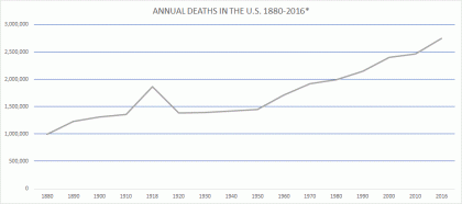
From this picture of the past and future, what can we learn about the the funeral market in the United States?
(*1880-1930, death registration area death rate applied to total U.S. population count. See below.)
Throughout human history, changes in the big picture environment of a group of people have often led to changes in the way those people live. Changes in social structure leading to changes in culture. Macro affecting micro.
Population increases and decreases would be quintessential examples of the big picture. If a bunch of people start moving into a neighborhood, or leaving, people within that area might end up doing things differently.
An institution like whichever one happens to handle the dead within a given society, being very population-dependent, can be susceptible to changing when there are major demographic shifts. This seems like an obvious sort of observation, but it hasn’t been explored much, especially in the modern context.
Patterns emerge from changes in death totals that should be of interest to anyone concerned with the funeral business, not least of all people working in that industry.
It will take more than a few posts to tell this story, but a key part can be explained very simply by showing what sort of market the first few generations of American funeral directors inhabited.
To skip ahead briefly, however: I will point out that the American funeral industry took shape in the second half of the nineteenth century, first in some of the larger eastern cities, and had become dominant throughout the entire U.S. by the beginning of World War II. Some rural areas such as in Appalachia did not have ready access to modern embalming until the early 1940s.1 But for present purposes, I will note that the funeral business was functioning in many of our major population areas from the 1880s onward.
As mentioned in a previous post, we don’t have complete death statistics from before 1933. But we can do a bit of extrapolation using data we do have to get a fuller picture of death in America. In the early years of mortality counting, from 1880 through 1933, the agencies responsible designated a “death registration area” that began with just a few cities but gradually encompassed the entire country.2 The death registration area death rates are shown in the early years of the 1880-2060 chart posted earlier.
I think the death registration area death rates were probably not too far off from the situation in the rest of the U.S. If we multiply those validated death rates by the actual U.S. population totals for those years from the previous post, we get the following:
| YEAR | POPULATION | DEATH RATE | TOTAL DEATHS* |
|---|---|---|---|
| 1880 | 50,155,783 | 19.8 | 993,085 |
| 1890 | 62,947,714 | 19.6 | 1,233,775 |
| 1900 | 76,094,134 | 17.2 | 1,308,819 |
| 1910 | 92,406,536 | 14.7 | 1,358,376 |
| 1918 | 103,202,801 | 18.1 | 1,867,971 |
| 1920 | 106,466,420 | 13 | 1,384,063 |
| 1930 | 123,076,741 | 11.3 | 1,390,767 |
(I include the out-of-series year 1918 as a matter of interest to show the affect the Spanish flu had, but also because, as a part of the funeral business landscape, 1918 shouldn’t be overlooked).
Let’s take a look at the graph at the top. (Full data list is below):
While there is probably a lot to be learned from the data posted so far on this blog, the fact to focus on in the graph above is the line extending from 1890 (1,233,775 deaths) through about 1955 (1,528,717 deaths):
Look at how flat it is. For a period of 65 years, when the U.S population grew by almost 105 million people, the number of annual deaths increased by less than 300,000. For most of that period the rate of increase is nearly nonexistent.
This was the formative period of the American funeral industry, a time of major changes in the United States, including tremendous population growth, but a surprisingly static market environment resulting from a healthier population and plummeting death rate.
Changes would come, both to the population and the industry. As shown in the earlier graph, from 1956-2016 the annual death totals from that growing population increased more quickly than in the previous half century. The funeral business began to partition, go asunder, and eventually become transformed. Population and death totals weren’t the only factors affecting the funeral home and cemetery businesses, but they were significant.
Those historical changes all merit discussion, but actually I only present them as preface to a far more interesting scenario coming upon us, which I plan to explore, in the future, from a number of different angles.
Until then, this chart is worth thinking about.
| YEAR | TOTAL DEATHS* |
|---|---|
| 1880 | 993,085 |
| 1890 | 1,233,775 |
| 1900 | 1,308,819 |
| 1910 | 1,358,376 |
| 1918 | 1,867,971 |
| 1920 | 1,384,063 |
| 1930 | 1,390,767 |
| 1940 | 1,417,269 |
| 1950 | 1,452,454 |
| 1960 | 1,711,982 |
| 1970 | 1,921,031 |
| 1980 | 1,989,841 |
| 1990 | 2,148,463 |
| 2000 | 2,403,351 |
| 2010 | 2,468,435 |
| 2016 | 2,744,248 |
-
James K. Crissman, Death and Dying in Central Appalachia: Changing Attitudes and Practices (Urbana: University of Illinois Press, 1994), 35–36↩
-
National Office of Vital Statistics, “Vital Statistics of the United States, 1950: Vol. I, Analysis and Summary Tables” (Washington, D.C.: U.S. Public Health Service, 1954), 4–10, https://www.cdc.gov/nchs/data/vsus/vsus_1950_1.pdf↩
