Tag Archives: data

The Baby Boom Generation

The next piece in our data puzzle is the reason for the projected future death totals in America. Here we learn that the secret to predicting deaths, is births.

To cut right to the chase, this chart from the U.S. Census Bureau “Current Population Reports”1 tells the story:

Data tables and several additional charts will give a fuller picture, but this one graphic shows why funeral-related businesses are likely entering a tumultuous period, why people who invested in “death care” stocks in the 1990s later asked themselves “what was I thinking?” and why our funeral practices may change in important ways.

Someone looking at business sectors to dabble in during the next 30 years may well wonder if the Census people were sending a message by making the bars on the right side green.

As we will see in future posts, cashing in on death-related services is not as solid a proposition as, say, elder care or other types of services for seniors; nevertheless, implications for the funeral business are guaranteed.

Here is the birth data2 that delivered us to our downward sloping future:

Continue reading The Baby Boom Generation

U.S. Mortality Totals During The Funeral Industry’s Early Years

From this picture of the past and future, what can we learn about the the funeral market in the United States?

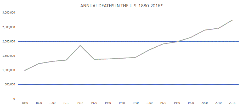
(*1880-1930, death registration area death rate applied to total U.S. population count. See below.)

Throughout human history, changes in the big picture environment of a group of people have often led to changes in the way those people live. Changes in social structure leading to changes in culture. Macro affecting micro.

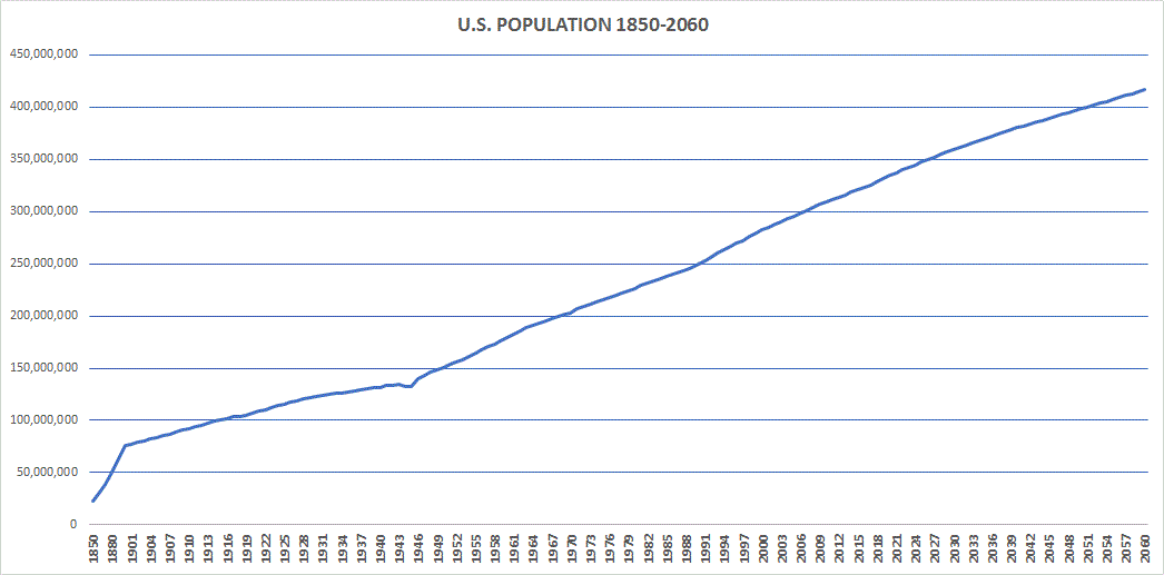
Population increases and decreases would be quintessential examples of the big picture. If a bunch of people start moving into a neighborhood, or leaving, people within that area might end up doing things differently.

An institution like whichever one happens to handle the dead within a given society, being very population-dependent, can be susceptible to changing when there are major demographic shifts. This seems like an obvious sort of observation, but it hasn’t been explored much, especially in the modern context.

Patterns emerge from changes in death totals that should be of interest to anyone concerned with the funeral business, not least of all people working in that industry.

It will take more than a few posts to tell this story, but a key part can be explained very simply by showing what sort of market the first few generations of American funeral directors inhabited.

To skip ahead briefly, however: I will point out that the American funeral industry took shape in the second half of the nineteenth century, first in some of the larger eastern cities, and had become dominant throughout the entire U.S. by the beginning of World War II. Some rural areas such as in Appalachia did not have ready access to modern embalming until the early 1940s.1 But for present purposes, I will note that the funeral business was functioning in many of our major population areas from the 1880s onward.

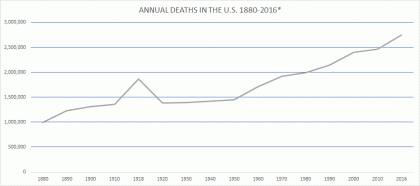
As mentioned in a previous post, we don’t have complete death statistics from before 1933. But we can do a bit of extrapolation using data we do have to get a fuller picture of death in America. In the early years of mortality counting, from 1880 through 1933, the agencies responsible designated a “death registration area” that began with just a few cities but gradually encompassed the entire country.2 The death registration area death rates are shown in the early years of the 1880-2060 chart posted earlier.

I think the death registration area death rates were probably not too far off from the situation in the rest of the U.S. If we multiply those validated death rates by the actual U.S. population totals for those years from the previous post, we get the following:

*Estimated deaths in U.S., 1880-1930, applying death rate from death registration area to total U.S. population
YEAR POPULATION DEATH RATE TOTAL DEATHS*
1880 50,155,783 19.8 993,085
1890 62,947,714 19.6 1,233,775
1900 76,094,134 17.2 1,308,819
1910 92,406,536 14.7 1,358,376
1918 103,202,801 18.1 1,867,971
1920 106,466,420 13 1,384,063
1930 123,076,741 11.3 1,390,767

(I include the out-of-series year 1918 as a matter of interest to show the affect the Spanish flu had, but also because, as a part of the funeral business landscape, 1918 shouldn’t be overlooked).

Let’s take a look at the graph at the top. (Full data list is below):

Continue reading U.S. Mortality Totals During The Funeral Industry’s Early Years

U.S. Population 1850-2060

Continuing with our data series, this graph shows how the U.S. population has grown over the last 150 plus years. What doesn’t jump off the page is the rate of growth which was quite high relative to the size of the population prior to 1925.

To put it in context, the population growth rate in America from 1926 until now has been at or below 1 percent most years except for those between 1946 through 1964, aka the Baby Boom.

But from 1850 through 1925, apart from the Spanish Flu year of 1918, the annual population growth was near or even over 2 percent, which is remarkable. Actually, in the early years shown on the far left side, which I only break down by decade, the population increases each year were from 2 to 3 percent.

Much of the growth was from immigration, which is mainly a story for another day, except for the fact that most immigrants to America ended up living in the cities. Thus the period from 1850 to 1930 was one of growth as well as urbanization. And because the overall quality of life in cities was not so great back then, it was also a period of plentiful death.

As noted in a previous post, we don’t have accurate death totals from that part of American history, but we can do an interesting statistical experiment using the death rate from that early period, in a future graph.

For now, here is a graph of the U.S. population from 1850-2060, with the portion after 2017, obviously, projected, and below it are the data by year.

Continue reading U.S. Population 1850-2060

Annual Deaths In The U.S. 1933-2060

Continuing with our data series, the number of deaths each year brings the percentages into a clearer picture.

You can see that for a long stretch of time, even while the U.S. population continued to increase (by how much? Hint: a lot—stay tuned for another chart), the number of people dying each year remained relatively static. Yes, the number of annual deaths increased, but very slowly.

As a side note: the reason I’m beginning this graph in 1933 is because we don’t know the actual death numbers from before that year. It took some time for the entire U.S. to buy into the need to keep such records. As early as the 1880s a few places like Massachusetts and Washington, D.C. kept official death records, but it was a slow process to expand the “death registration area” to encompass all of the nation.

If you look at the beginning on the left and follow the line across, you can see it took almost 70 years, from 1933 to 1999, for the mortality number to increase by a million, and for 10 years after that it barely increased at all. Population growth during the period made that line seem even flatter in terms of number of funerals per capita.

While population increased, and technology made work easier, people died from a lot fewer things, and life in general got better than it had been for the entirety of recorded history, there seemed to be less death occurring around most of us, including around funeral businesses. The latter were not unaffected by this ongoing state of affairs.

Here is a graph of the mortality figures in the United States from 1933 onward, and below it are the data by year.

Continue reading Annual Deaths In The U.S. 1933-2060